Responsive Breakpoints
Test media queries using our breakpoint presets:
- Mobile: <768px
- Tablet: 768px-1024px
- Desktop: >1024px
Real-Time Code Preview Environment
Master real-time code previews with our comprehensive tutorial
Real-time preview updates as you type with 50ms refresh interval
Dedicated editors for HTML, CSS, and JavaScript with syntax highlighting
Test responsive designs across 10+ device presets including iPhone and iPad
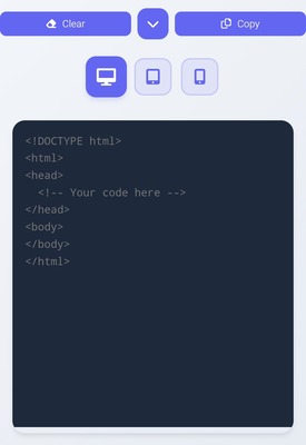
<!-- Sample HTML Structure -->

<div class="container">

 <h1>Hello World</h1>

</div>
Auto-refresh every 2 seconds
Error console with line numbers
Test media queries using our breakpoint presets:
Connect your repos for direct code import/export
Preview changes directly from your editor
Yes! Our Pro plan offers real-time collaboration features with shared editing and comments.
We support all modern browsers including Chrome, Firefox, Safari, and Edge.
Use our contact form or GitHub issues page.